Margin in Month/Year view
I'm enjoying the new web UI. However, I've noticed what appears to be a margin issue in the Month/Year view.
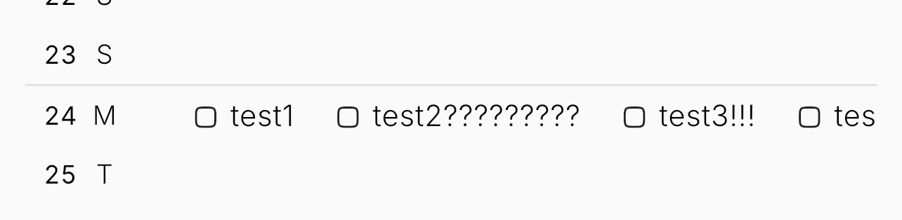
In the new web version, items in each row are displayed with equal spacing, as shown in the first image, regardless of the character length of each item's text.
In the iOS version, which still uses the older UI, the width of each item in a row is instead determined by the length of its text, as shown in the second image.
As a result, the new web version's Month/Year view only shows 3 items per row, with any additional items getting cut off. The old UI allowed many more items to be visible at once. This makes the new web version noticeably less convenient for me in this regard.
Web:

iOS:
Log in to comment and vote
No comments yet
Be the first to share your thoughts.